From Bland to Brand: Email Design Best Practices to Follow in 2025
Use these email design best practices to create campaigns relating to recent trends and increased conversions. Get inspired by our examples.
Campaign Refinery Team
Email Marketing Experts
What you'll learn
Email design best practices involve various strategies to create emails that are both visually appealing and achieve your marketing goals.
Effective email marketing requires strong email content and compelling design. Design acts as a visual hook to draw your readers into your well-written email content. Without proper visual hierarchy, your subscribers may be lost in the endless, boring content loop.
But forget those text-heavy templates and generic stock photos. It’s time to ditch the bland and embrace the brand — we’ll go over the critical components of email design, best practices, and examples to inspire you.
What is Email Design?
Email design is the art of using strategic email elements such as fonts, colors, and logos to achieve specific marketing goals.
Your design choices influence email campaign metrics and highlight brand identity. For example, using your logo and brand colors in all email campaigns will keep your brand top of mind with subscribers.
Effective use of email design helps you:
- Stand out from cluttered inboxes and entice recipients to open your emails.
- Present your messages in a way that’s easy to understand and navigate.
- Encourage readers to interact with your content, click on CTAs, and convert.
- Reinforce your brand image through consistent use of elements.
The way you handle email design elements can vary depending on the type of email campaign you send. For example, a transactional email may not require as many images as a marketing newsletter. It’s critical to strike the right balance because your email design can directly impact your conversions.
Before we get into the visual aspects of email design, let’s start with the practical side for a more comprehensive approach.
The Impact of Email Design On Conversions
Email design directly influences how recipients engage with your emails. Is it pleasing enough for them to open and read it? Or is it cluttered and hard to navigate?
You can establish professionalism or a casual approach based on various design elements.
| Aspect of Email Design | Impact on Conversions |
|---|---|
| Consistent branding | Increases brand recognition and trust |
| Clear CTA | Helps recipients take the desired action |
| Responsive email design | Ensures optimal display |
| Personalization | Helps with higher conversions |
| Visual appeal | Captures recipient attention and encourages engagement |
| Clutter-free layout | Helps digest information and take necessary action |
Some business owners outsource template designing to experts or use built-in templates in their ESP. Sometimes, people who do it by themselves could fall victim to these common design mistakes, jeopardizing overall email campaign performance.
Common Email Design Mistakes And How to Avoid Them
Here are common email design mistakes and how to fix them.
| Mistake | The Problem | How to Fix It |
|---|---|---|
| Unresponsive design | Emails not optimized for mobiles lead to frustrating user experience | Use responsive email templates that automatically adjust elements according to screen sizes |
| Text overload | Dense text makes emails look cluttered | Break down text for scannability and use bullets or numbered lists |
| Poor image quality and relevance | Irrelevant or blurry visuals decrease the email quality | Use professional-looking images consistent with your brand identity |
| Skipping accessibility | Excludes users with disabilities | Integrate alt text, keyboard navigation, etc. to increase inclusivity |
| Forgetting the unsubscribe option | It’s a bad email marketing practice and violates the laws | Include a clear unsubscribe link or button in all your emails |
As you begin to send different email campaign sequences, adhering to email design best practices will help you design functional emails, remain ahead of trends, and boost brand visibility.
Core Email Design Best Practices 2024
Every email campaign is a chance to craft the perfect user experience and increase the likelihood of conversions.
Whether you’re a design expert or not, following these best practices in email design can help you create aesthetic and functional emails.
1. Mobile-first Design
With fast-paced lifestyles, it’s no surprise that 55% of all emails are opened on mobiles.
A mobile-first approach focuses on optimizing for mobiles rather than desktops or tablets.
Here are key principles and strategies to implement mobile-responsive email design:
- Use content hierarchy: Determine the most critical information and use it first.
- Implement responsive design: Use responsive email design templates with single-column layouts, flexible images, and fluid grids to adapt to different screen sizes.
- Optimize email performance: For quicker email loading times and better user experience, minimize file sizes and reduce HTTP requests.
- Utilize thumb-friendly navigation: Ensure all navigation buttons and interactive elements are well within reach of the user’s thumb without them having to maximize the screen.
- Use legible fonts: Use legible fonts and typefaces, create contrasts, and utilize line spacing.
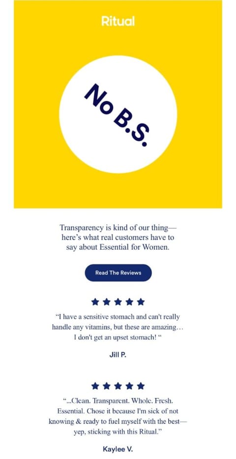
The design trends for 2024 are moving toward interactive elements and augmented reality. Subtle animations, hover effects, and AR experiences can make your emails stand out.
2. Prioritize Readability and Clarity
As subscribers open your emails, they must be able to understand three critical aspects: What the email is about? Why should they engage with the email? And what can they expect in the future?
The above is only possible when you present clear and cohesive information, especially for readers who like to skim through emails. And that is plenty of people, since readers spend 12 seconds on average going through each email.
This means you must establish brand credibility, showcase value proposition, and persuade them to convert within the first twelve seconds.
While it might sound like a lot, you can capture subscribers’ attention with these simple tactics:
- Use high-quality fonts: Fonts can impact people’s emotions, behavior, and feelings. Choose clear and professional fonts that read well, especially on mobile devices.
- Create contrast: Ensure optimal contrast between text and background images to increase readability. Dark text on a light background or vice versa provides the best contrast in emails.
- Use ample whitespace: Whitespace is the empty area surrounding the images or the text, which increases readability and clarity.
- Utilize bullets and numbers: Break up text into shorter paragraphs and use bullets for quicker scanning.
- Use descriptive headings and subheadings: Headings create hierarchy and make it easier for recipients to distinguish them from the text. Use clear subheadings to support your heading and guide subscribers through the email.
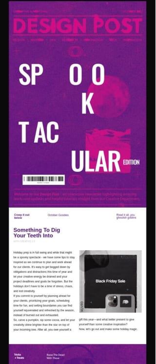
3. Leverage Visual Hierarchy
Think of emails as an inverted pyramid. It starts with the most important, provides supporting details, and ends with a CTA. While CTA is a critical component, you must convince readers to act before they land on it.
You can use the following tips to implement visual hierarchy and guide users to the CTA:
- Structure the flow: Organize your emails with headings, subheadings, and bullet points to create a seamless flow.
- Use strategic images: Use high-quality images and place them in a proper order.
- Employ visual cues: Use arrows, icons, and graphics to direct the recipient’s attention toward a specific action or content.
- Streamline the eye path: Design the email layout to guide users through a natural flow and avoid confusion.

Hyper-personalization is another growing trend that can engage customers and provide a better user experience. Use dynamic content and multimedia to craft tailored emails for every user.
4. Write a Compelling CTA
The CTA section is an opportunity to tell customers exactly what you want them to do next and give them a compelling offer to increase conversions.
You can use contrasting colors to make your CTAs standout. Use your brand colors but also implement mood-driven color choices to evoke certain responses from your audience.
Here are a group of colors and their meanings to help you pick the best choice.
| CTA Color | Meaning |
|---|---|
| Red | Urgency, excitement, action |
| Orange | Warmth, enthusiasm, encouragement |
| Yellow | Optimism, attention-grabbing |
| Green | Safety, go-ahead, success |
| Purple | Creativity, luxury, elegance |
| Black | Sophistication, elegance |
| White | Simplicity, purity, and neutrality |
| Gold | Prestige, luxury, and exclusivity |
Choose colors that complement your brand colors and create sufficient contrast for better readability.
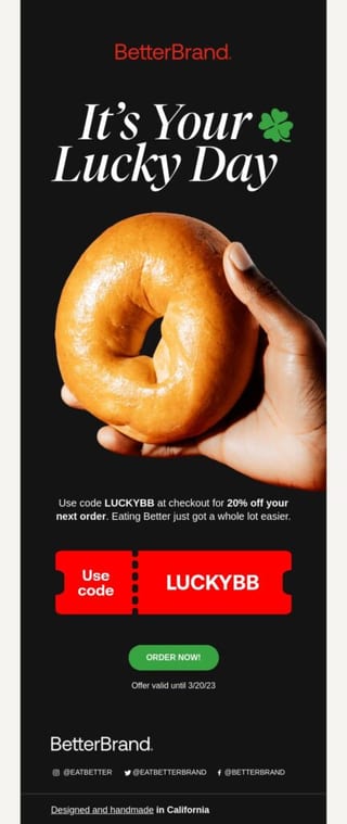
5. Be Consistent With Branding
Consistent branding is crucial to help subscribers immediately recognize and associate with your brand. Use the same brand colors, logo, and other brand elements in all email campaigns.
Here’s a quick checklist you can review before sending emails:
- Ensure your logo is consistent across emails.
- Define a primary and secondary color palette that reflects your brand’s personality and values.
- Select font styles that depict brand personality and keep them consistent in headings, subheadings, and body text.
- Define the imagery style and layout for all email types.
- Deliver a consistent brand experience at every stage of your customer journey.
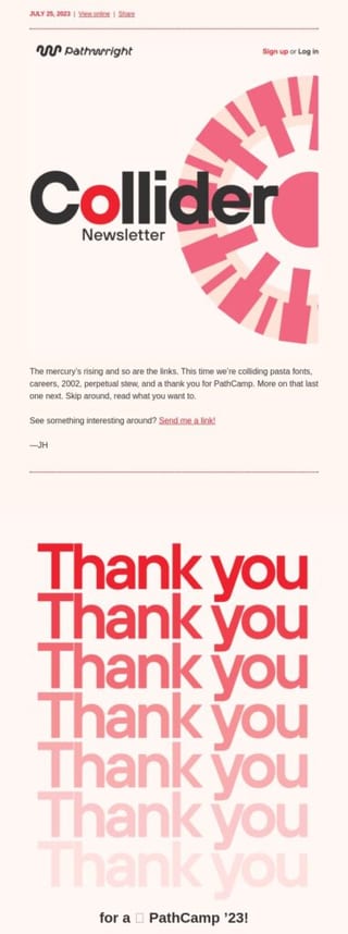
Nostalgic design elements are a fast-growing design trend in 2024. Using vintage fonts, color palettes, and retro vibes help bring people closer to your brand.
These email design best practices help capture audience attention, but you won’t be able to reach maximum engagement until your emails are properly formatted.
From the email header to the footer, each email contains critical components that work together to make it a success.
Email Parts of a High-Converting Email
A high-converting email is like a well-oiled machine, with each part working together to achieve a specific goal and drive recipients toward the desired action. Each email part influences customer actions, ultimately increasing open rates and conversions.
Let’s dissect the key components that make a high-converting email.
| Parts of an Email | Purpose |
|---|---|
| Header | Contains key information about the sender, recipient(s), and the email. |
| Subject line | Informs and grabs the audience’s attention |
| Preheader | Complements the subject line and encourages recipients to read further |
| Salutation | Greets recipients and improves email personalization |
| Email body | The actual email content that informs and engages readers. |
| Call-to-action | Elicits recipient response |
| The Footer | Includes the mailing address, social links, legal disclaimer, and unsubscribe link. |
| Attachments | Provides additional information, such as documents and other media |
Individually focus on these parts to get your design essentials right. We’ll delve into the design basics for a compelling email format.
The Header
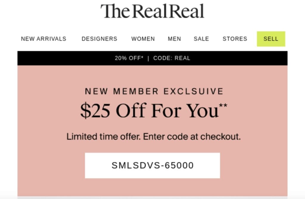
The header showcases your sender name and sets the tone for the entire email. This is your opportunity to build trust and brand credibility with recipients.
Ensure to include the following in the email header:
- Logo: Include the company logo prominently in the header to allow readers to recognize the email.
- Sender information: Clearly showcase your sender name and email address to increase credibility.
- Visual brand elements: Use colors, patterns, or images that align with your brand and enhance visual appeal.
- CTA or hero image: Consider incorporating a CTA or a hero image to encourage immediate action from the recipients.
Subject Line
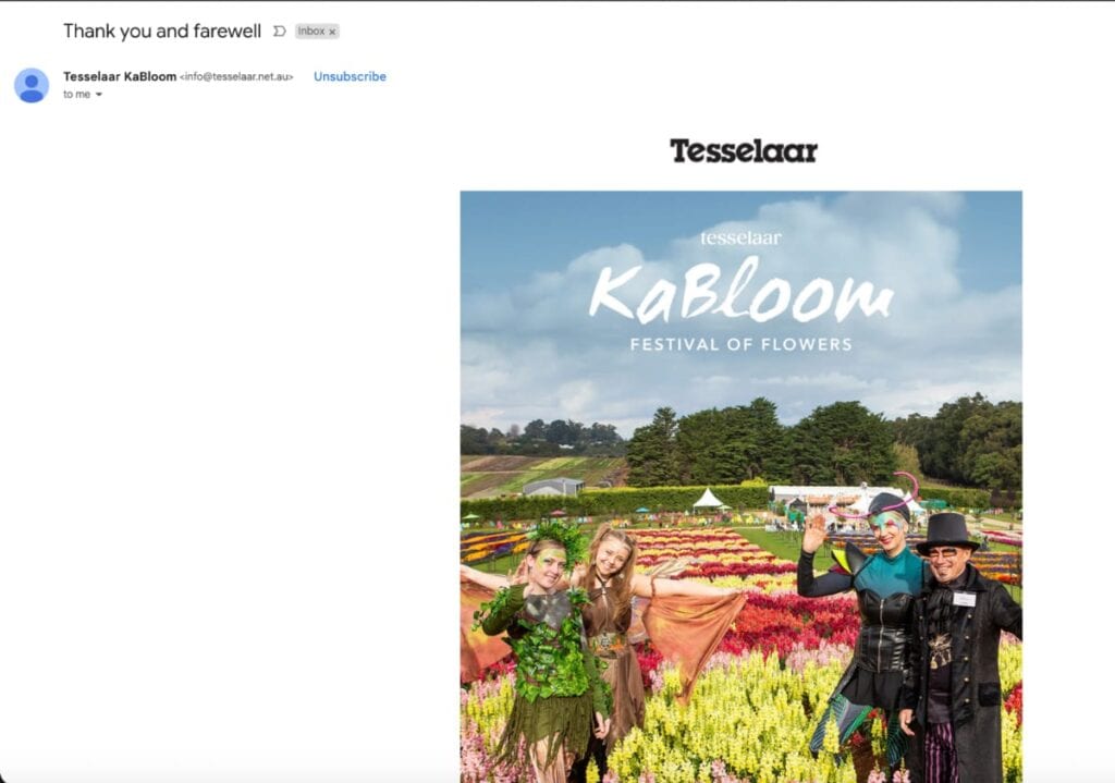
Include relevant and compelling information in the subject lines to capture readers’ attention and entice them to open the email. Initially, it could be challenging to craft intriguing subject lines, especially with the limited character count (ideally 30 – 50 characters).
However, these best practices can help you write better subject lines:
- Provide clarity: Give readers a gist of the email in your subject lines, whether it’s for Valentine’s Day or St. Patrick’s Day. Avoid vague or ambiguous information that could confuse the recipients.
- Be concise: Keep the subject line between 30-40 characters to maximize impact.
- Promote urgency: Use time-sensitive language such as “Limited time offer” to encourage immediate participation.
- Use personalization: Include the recipients’ names, locations, or past interactions to increase relevance and make them feel valued.
Preheader Text
Preheader text is the little snippet next to the subject line that provides additional context in emails. While not as prominent as the subject line, the preheader can encourage recipients to open emails.
A good pre-header text will:
- Complement the subject line and provide additional information.
- Communicate the value proposition of opening the email.
- Spark curiosity with intriguing information.
- Use clear and actionable language.

Email Body
Although text-oriented, the email body is one of the main elements that determine the success of recipient conversions. A clear and well-structured email content creates room for easier understanding and better engagement.
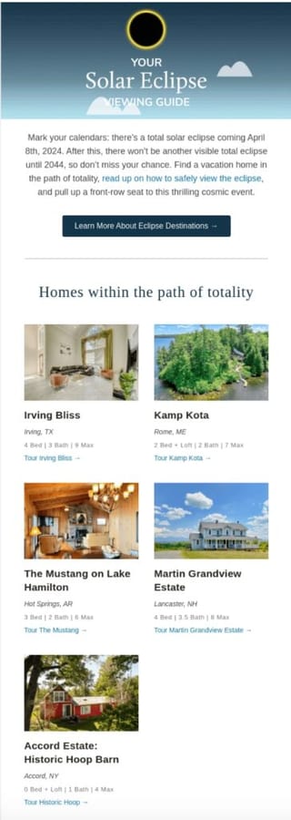
The email body does not involve design elements as such, but following these tips will help:
- Establish a clear hierarchy: Use a single or double-column layout depending on your marketing needs. You can use inverted pyramid, F-pattern, or hybrid layouts.
- Highlight key points: Use formatting such as bold, italics, or underlining to point out important information.
- Balance text and images: If you are wrapping images around text, ensure that you balance them with enough white space.
The Footer
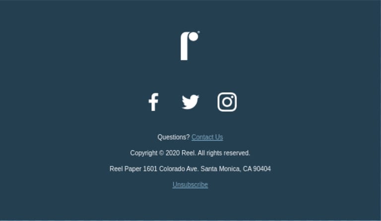
Email footer is where important brand information and legal compliance go, so keeping it minimalistic is important. Use pastels to add a pop of color and retain legibility.
Ensure your footer looks good and is functional, especially on mobile devices. Use whitespace for a clean and organized look and maintain consistency with other branding elements.
More importantly, include an unsubscribe link or button for users to easily opt out.
Campaign Refinery offers a simple one-click opt-out option in all emails clients send out.
Email Design Best Practices For Better Brand Recall
Crafting emails that not only resonate but build a lasting impression with your subscribers is necessary for brand recall.
It’s important to be consistent with email designs, regardless of the type of emails you send. To help you design better emails, we’ve collected examples and best practices for each campaign type.
Designing Different Types of Emails: A Quick Overview With Examples
Each email campaign is built differently and serves a different purpose. A welcome email could have lots of colors and images to show excitement and thank subscribers. Whereas, a cart abandonment email will only have images relating to the products customers left behind.
To make emails more entertaining, have an appropriate balance of images and content. You can utilize the following tips and be inspired by the examples.
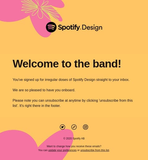
1. Welcome Emails
A welcome email creates the first impression with your subscribers.
- Goal: Introduce your brand, build a positive impression, and encourage further interaction.
- Design: Keep it clean and visually engaging. Feature your brand logo prominently and offer a clear CTA.
2. Promotional Emails
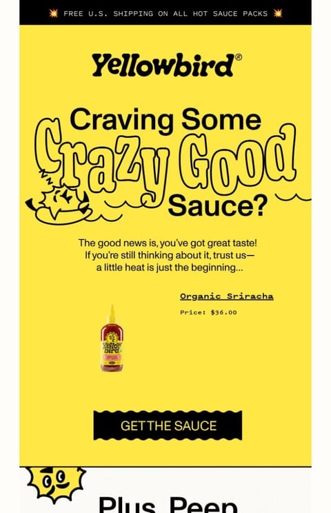
A promotional email is a subset of marketing email.
- Goal: Announce sales, discounts, or new products.
- Design: Use bold colors and eye-catching visuals with a strong CTA.

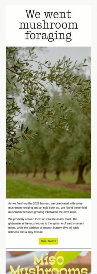
3. Newsletter Email
An email marketing newsletter is a series of emails sent on a regular basis.
- Goal: Share valuable content, industry news, or blog articles to nurture subscribers and build brand reputation.
- Design: Use a mix of text, visuals, and interactive elements to showcase brand personality.
4. Abandoned Cart Emails
Abandoned cart emails aim to recover lost sales by incentivizing recipients to complete the purchase.
- Goal: Remind users of their unfinished purchases.
- Design: Highlight the abandoned cart items, use compelling product images, and use contrast in the CTA.
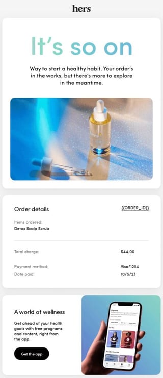
5. Transactional Emails
Transactional emails contain critical information such as order updates, shipping information, etc.
- Goal: Provide order confirmations, account verification, etc, based on the user action.
- Design: Include branding elements and avoid using too many images and interactive elements. Keep the text easily skimmable while highlighting important information.
These are just several examples we picked. Consider your specific goals and target audience when designing an email. More importantly, ensure to make your emails accessible to all types of readers, including people with visual impairments.
Email Accessibility: Designing Emails For All
In the competitive digital landscape, designing emails for all is not just a best practice but a necessity. When you make specific alterations, your emails can be enjoyed by users with disabilities, increasing inclusivity.
Consider the following aspects before you design emails with accessibility.
| Feature | Method | Benefit |
|---|---|---|
| Alternative text | Provide concise description of your images | Screen readers convey information to visually impaired users |
| Color contrast | Maintain sufficient color contrast between text and images | Ensures better readability for users with partial visual challenges |
| Logical structure | Organize content using headings, sub-headings, and bullets | Improves readability for users with cognitive disabilities |
Customers are increasingly looking for socially responsible brands as design trends and preferences continue to evolve. With full access to Campaign Refinery, you can produce beautiful emails while still being socially responsible.